So far in this series, we’ve covered:
This article will be a deep dive into funnel step 2, activation.
To start, let’s define activation as the first time a student has an interaction with your tutors or coaches in a given period (the term activation comes from the marketing world).
We recommend studying your activation rate and working to improve it over time. To measure activation, you can look at either the (1) number of unique students served or (2) the percentage of the campus who’ve used your services (unique students divided by student body). Please refer to Analytical Thinking for a deeper explanation of the funnel and key metrics.
In this article, we’ll go through a few key ways that learning centers can improve activation rates, including:
Let’s get started!
Your scheduling system is very important, and students are often nervous to engage with a tutor for the first time. Engaging with a tutor means meeting a new person, admitting where you are struggling, and, worst of all, feeling dumb! No one likes that.
No matter what system you use, it’s critical to make scheduling as easy as possible. The student will be looking for any excuse to not move forward. Confusion, bugs, or a lengthy process will lower your activation rate and cause drop-off at this stage in the funnel.
On the flip side, a great scheduling experience is actually a positive because it imparts a feeling of trust from the get-go and encourages student-to-student referrals.
Quick note that Penji’s main product is a mobile-friendly, accessible scheduling system, and you can check it out below:
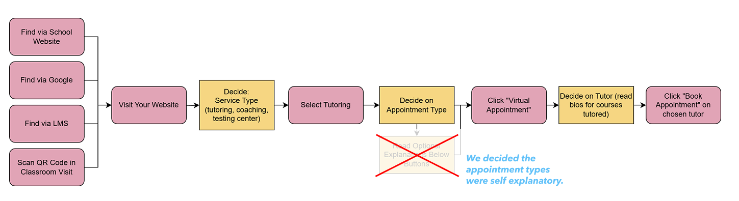
The first step I recommend is to go through scheduling a session yourself (or exploring how your schedule is shown, if you offer drop-in). As you go through your process, map out every step and include decision points where you find yourself needing to think. Here is a sample I made using draw.io:

We want to slim and simplify wherever possible. Watch out in particular for two things that impart cost to the user:
Decisions are mentally taxing, while actions can be irritating.
Decisions - “Don’t Make Me Think”
I read a great book about user experience design called Don’t Make Me Think, and the title says everything you need to know. Any time you make the user think, you are taxing them and deterring them from proceeding. Be very sure the decision is necessary, and if it is, make the choices as clear and distinct as possible.
Let’s look at our sample flowchart again with a special eye towards the decisions, or “thinking” time, which I’ve marked in yellow. For each of these decisions, you can consider these three changes:
Actions - Reducing the clicks
While decisions are perhaps the most costly, great user experiences also cut down the clicks and actions that must occur to finish the flow. Try and eliminate every action in your flow - simple as that. Ask yourself, “Does it really need to be there?”
Now that we understand actions (pink) and decisions (yellow), what can be improved here?
.png)
Starting from the left, we see that clicking a link in the LMS takes us to a decision on the website. Is this step actually necessary? Would it work if we skipped straight from the LMS to the tutor-scheduling flow? If LMS links are always used for tutoring, getting right into scheduling would not surprise a student and should work fine. You may lose some value (”we like our website!”), but you are also simplifying the experience for students, and thus it may be worth it.
.png)
A key decision in the flow is the appointment type. Perhaps that decision is essential (e.g. single session or weekly), but we might notice that there is a lot of text on the page that actually isn’t that valuable. We can typically eliminate the explanations of the appointment type options since they are pretty self-explanatory. Less text is almost always good because seeing text means you either (1) have to read every word or (2) skip reading it but feel a bit of anxiety that you missed something important. By slimming down the text, we make this decision easier.
With those improvements in mind, let’s take a look at a real learning center scheduling page and see what we can come up with!
One of the most common mistakes I see is having an info-heavy page where there are multiple possible decisions with unclear reasons why you’d choose one thing over another.
.png)
In this example, the student pursuing support has three boxes to choose from, but it is not a very clear decision. Does the first box show drop-in hours? No, I see it says appointment in small text in there. So how do I schedule? I guess I move to the second box to the right, since those are actually related. But I also see a third box for drop-in with a different name, so I guess this third box is not related to the first box’s hours. I am already feeling slightly confused.
Next, should I book an appointment with library peer tutors or go to the STEM Hub drop-in? They seem like distinct services, perhaps offered by different departments, so which should I try first? Which has better tutors? A student might be able to easily decide if they prefer appointments or drop-in, but describing these are different services with likely a different set of tutors creates additional anxiety in the decision. Do we really need to let the user know about this difference, which complicates the decision? Maybe, but if you can get away with it, I’d simplify the choice to either appointments or drop-in at this stage, and educate them more about the service later in the flow.
Finally, the “Types of Tutoring” explanations at the bottom introduce even more options to understand: academic skills, content, and writing. Do I find those options within the scheduling flow or on another page? Do we really need to discuss those now, along with all of this other information?
The goal is to simplify everything down to its truly essential parts. The simplest version of this page is simply a choice between appointments and drop-in. If I wanted a tutor, I could then just pick my preferred modality and keep moving.
Next up, we’ll consider the different access points someone could reach your center, mainly mobile versus web.
40% of sessions are scheduled from students’ phones! That’s what our data shows, at least. Penji sees 130,000 unique students per month using the platform across desktop browsers, mobile apps, and mobile browsers (e.g. Safari on an iPhone), and we see that over 40% of student interactions with Penji happen from a phone.
.png)
This shows how critical it is to get mobile right. If you have a broken or frustrating mobile flow, you are severely impacting almost half of the student interest and usage of your service.
Make sure to regularly test out your scheduling workflows using your phone’s browser. A couple of notes:
You’ve now considered the key basics for optimizing scheduling, but this will only take you so far if you don’t have tutors, courses, or times that work for students, so let’s move on to that next.
This is the lowest hanging fruit for most centers. It is useful to know which days and times of the week are most consistently visited by students on a course-by-course basis. Review this data each term to discover insights about schedule changes you’ll want to make. How? Here is a basic data analysis process you can do in Excel to create a map of your days and times.
This guide will help you take your visits information from a spreadsheet of all of your center traffic, in whatever format you have it, and turn it into a heat map like this:
.png)
Video Guide
You can follow along at the video below:
Step 1: Organize Data
=WEEKDAY(cell_reference, 2) , where you replace “cell_reference” with the correct cell in your spreadsheet, for example “A2”.=HOUR(cell_reference_time). Watch my video guide above for common issues and FAQs entering these columns.Step 2: Create Pivot Table
Step 3: Format as Heat Map
Identifying inefficient spending where tutors are being paid but not working with students can point you to areas of low student demand that may surprise you. Shifting away from these areas is just as important as shifting towards high demand because it saves you money that you can invest elsewhere.
At the end of a term:
You may be surprised at how inefficient your spending is with certain tutors. This usually isn't the tutor’s fault but is more indicative of an oversupply for hours for a given course, a bad time of day, or a modality that students aren't preferring.
To improve your activation rate, it’s important to consider what modality your students prefer: appointment, drop-in, group, and in-person versus online. I don’t have too much to say other than “test it!” Be comfortable experimenting over time with different modalities to see if you get stronger or weaker traction among students.
A list of options to consider:
Two other items that are certainly impactful but that I don’t have a lot of research on yet:
Activation rate is all about making it easy for a student to find support. Remove every barrier possible, simplify your processes and decisions, and offer the correct mix of hours and courses.
As with awareness, please be patient with your efforts. Some will work, some won’t, and any changes do take time to see the full effect. Continue with an iterative, patient approach to improving your center and you will see your funnel metrics improve.
I would love to hear your feedback at ben.h@penjiapp.com. Thanks for reading!
Discover how Kuali connects the work behind administration, research, compliance, IT, and more.
Explore Kuali solutions ->
Effective academic support depends on connecting students with the right resources at the right time. But as programs grow, disconnected scheduling tools, databases, and manual processes can make it difficult for staff to see the full picture. At Duke University, the Academic Resource Center (ARC) supports students through peer tutoring, learning consultations, and programs like SAGE (Student…

At the University of Central Missouri (UCMO), making academic support accessible means creating an experience that works for everyone involved. Students need an easy way to find help, tutors need flexibility to manage their schedules, and administrators need clear information to understand how their services are being used. Kuali Reach brings those pieces together. With an easy-to-use experience…

Working with hundreds of learning centers has given us a glimpse into what it takes to be successful and to grow engagement. In this article, check out the framework we've developed for learning center growth with a three-pronged approach focusing on Awareness (Marketing), Activation (First-Time Experience), and Retention. From impactful marketing tactics like orientation drives and faculty…


